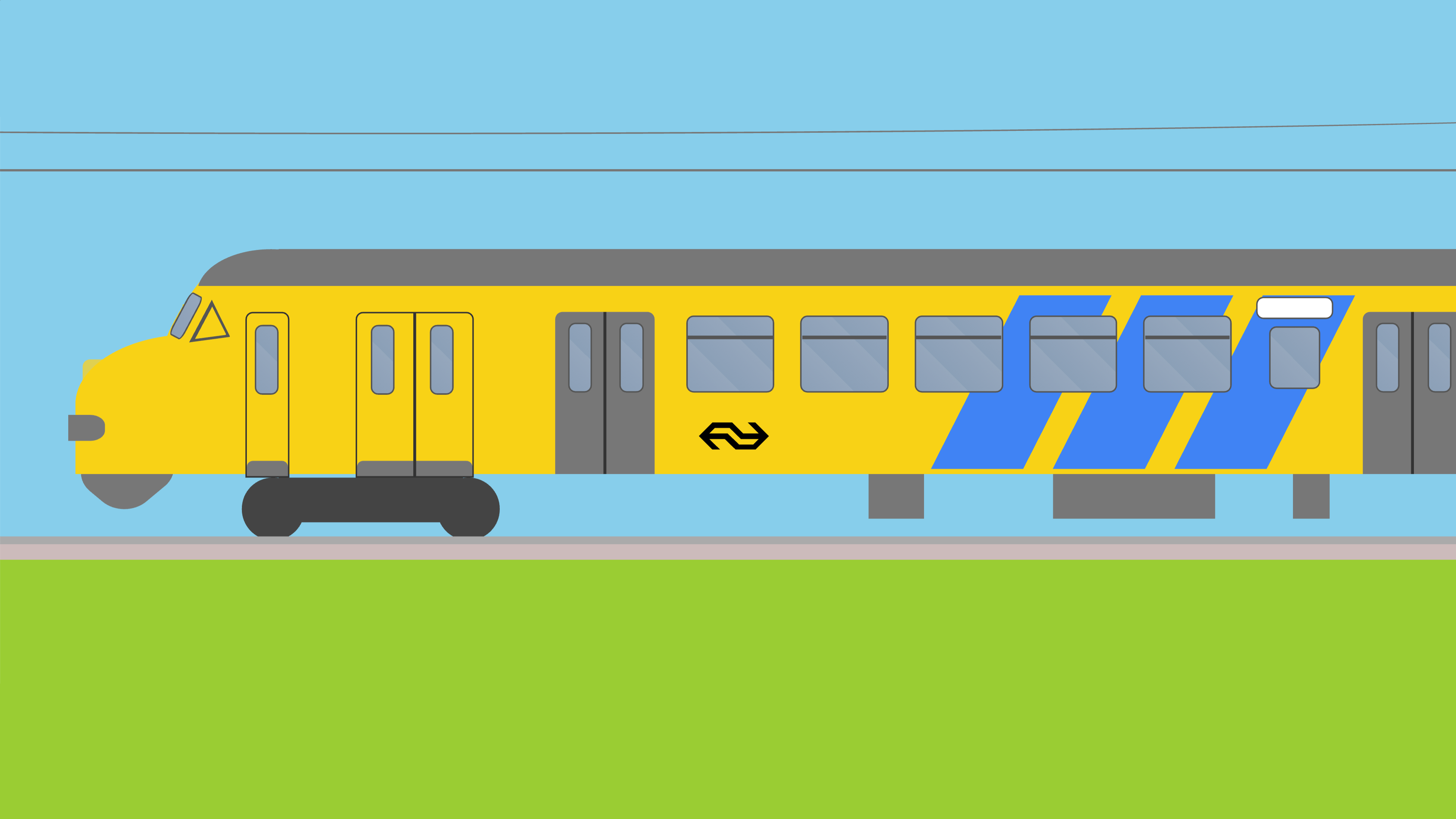
Dutch rolling stock, recreated using HTML and CSS

CSS is great – I love it! I don’t know why everyone keeps hating on it. To be fair, I’m a backend engineer, so I usually don’t have to worry about Internet Explorer 11, so my experiences probably don’t match those of most other CSS developers. I also have the tendency to use CSS for , so my use cases don’t match those of most other CSS developers either. And as you can see in the image above, I also use CSS to draw trains. My CSS trains page currently includes the following trains:
- Intercity Nieuwe Generatie
- Sprinter Nieuwe Generatie
- Flirt
- V250
- Sprinter Lighttrain
- Class 186
- VDL Futura
- ICE 3M
- Verlengd interregiomaterieel (refurbished)
- Dubbeldeksmaterieel (refurbished)
- Intercitymaterieel (refurbished)
- Class 1600/1700/1800
- Stadsgewestelijk materieel
- Mat ’64
- Mat ’54
- Class 1300
Having said that, drawing stuff using CSS is a very bad idea. There’s this thing called SVG that’s literally made to create vector graphics for the Web programmatically. Of course, it’s also what normal people do and therefore not as fun.
With that out of the way, let’s talk about drawing things in CSS! There are a couple of important differences between “normal” CSS and “CSS for drawings”:
-
Inconsistent rendering is a problem that doesn’t magically disappear when you try to use CSS the “wrong” way. It’s easier to ignore it for drawings though, especially if they look like garbage anyway.
-
Absolute positioning is one of those things that you should normally avoid, because it makes it a lot harder to create responsive interfaces. In the case of drawings, you’ll want to rely on absolute positioning as much as possible. Anything else is guaranteed to add a lot of complexity.
-
Browser-based user interfaces typically consist of boxes that are arranged in rows and columns. Drawings can include any type of shape in any type of arrangement. The best results are achieved by adding circles, triangles, and rectangles in the right places.
-
z-indices suddenly become one of your best buddies. Make sure you have a thorough understanding of how they work!

