The colours of Chuniversiteit

Every post on this website has its own header illustration. Were I to start this website today I’d probably use an AI tool like Midjourney to generate these images, but back then this was still something that had to be done by hand; in my case, using Microsoft PowerPoint. I might still decide to switch to AI art some day, but for now I’m still stuck with PowerPoint.
As of today, I have published a grand total of 200 posts, which means that I also have 200 slides worth of illustrations. In this post I’m going to turn those illustrations into colour usage data, which lets us look at them from a new perspective.
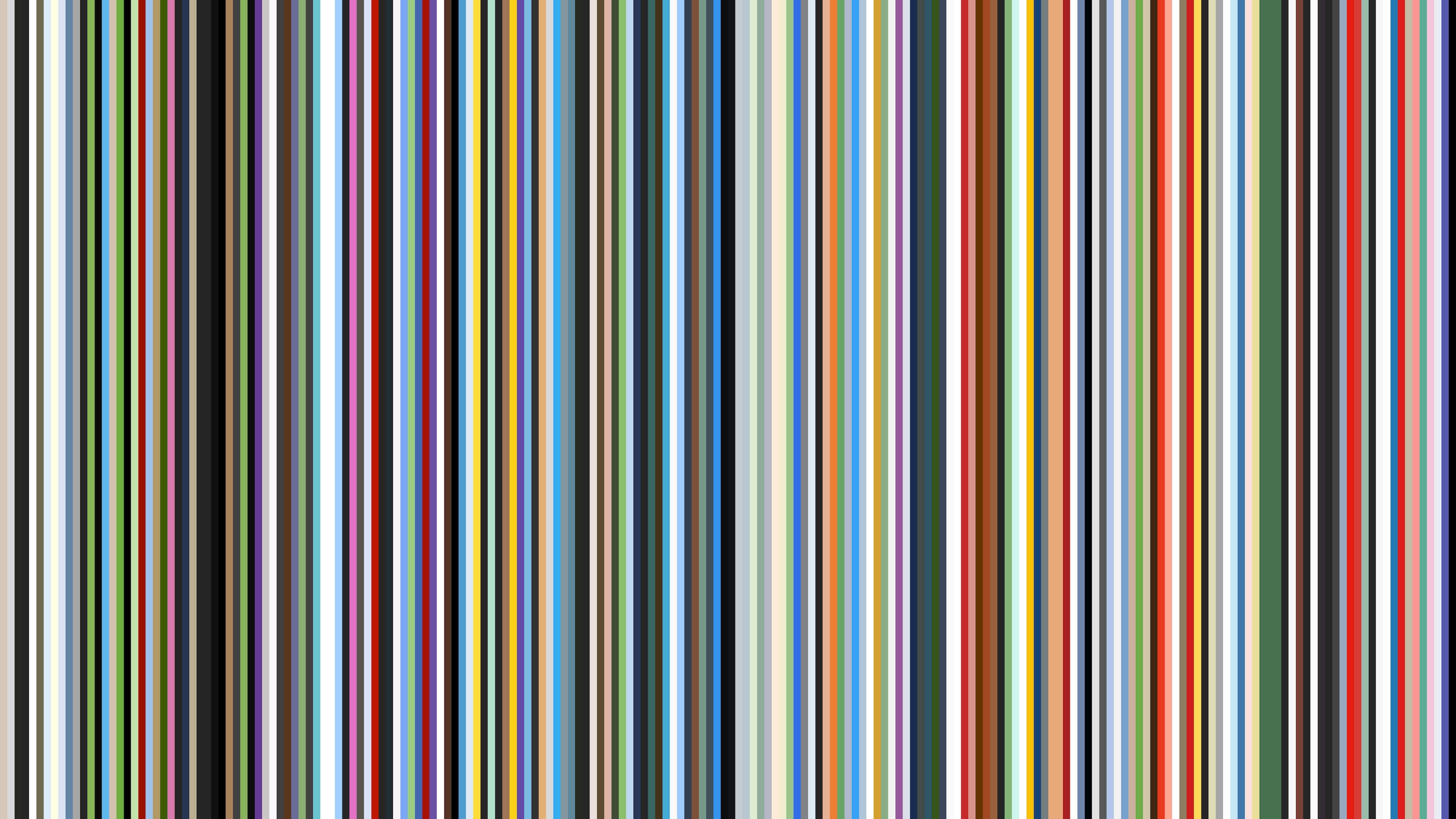
I wrote a simple Python script that goes through all posts in a chronological order and extracts the main (i.e. most commonly occurring) colour from each header illustration. Then I visualised these main colours as a horizontal stack of coloured bars; one bar for each header illustration. The result kind of looks like a movie bar code or a retro wallpaper in a nursery:

Movie bar codes tend to look like smooth gradients, because consecutive frames in a movie generally use similar colours. That’s clearly not the case here, as colour usage is all over the place:
-
Illustrations are independent from each other, so it’s unlikely that two consecutively published illustrations have the same main colour;
-
Illustrations don’t have to adhere to a fixed colour scheme, which results in a large variety of different colours.
Another interesting observation is that the right side appears to be slightly more vibrant than the left, which suggests that colour usage has changed somewhat over time.
Let’s try to bring some order to these bars. I modified the Python script to sort the bars by hue before drawing them on the canvas:

Although almost all hues and shades appear to represented in this visualisation it’s clear that blue, white and grey are used relatively often, while pink and purple illustrations are comparatively rare.
I asked myself what happens when we don’t just look at the primary colour of each illustration, but take all the colours into account. The answer turned out to be “corrupted image files”, because none of my editors and viewers were able to load the generated visualisations.
Fortunately, with a few small tweaks I managed to get something working:

This Saturn ring-like visualisation shows all colours that were used at least 1,000 times across all illustrations. Each bar represents usage of a colour in 10,000 pixels.
As you can see, illustrations are slightly more colourful than the second visualisation would suggest, although the distribution between the various hues remains mostly unchanged, so our previous observations still stand.
Oh, and one last thing… Remember when I said earlier that illustrations use a wide variety of colours because they don’t use a fixed colour scheme? The Living the Pipe Dream section is the one exception to this rule, as almost every illustration uses a lot of blue (but mostly due to coincidence):


